You want a moodboard that ignites ideas on sight, not one that looks like a Pinterest graveyard. Let’s build something that actually fuels your project, helps you make decisions fast, and feels like a creative playground you’ll return to again and again. No fluff, no mystique—just fun, clear steps and a sprinkle of chaos you control.
Start With a Vibe, Not a Shopping List

You don’t need a detailed brief to start.
You just need a vibe. Ask yourself: what should this thing feel like? Warm and nostalgic?
Slick and futuristic? Earthy and handmade? Write a one-line intention that sets the tone. Example: “Create a cozy, modern brand that feels like a rainy Sunday with a good book.” Tape that to your brain.
Use it to veto anything that looks cool but strays from the vibe. FYI: cool and relevant are not the same thing.
Make a Quick Guardrail List
Set simple rules so you don’t wander:
- Yes to: natural textures, muted greens, analog typography
- No to: neon, glossy gradients, corporate stock people
- Maybe: copper, serif headlines, handwritten accents
This keeps you focused without locking you in a creative jail cell.
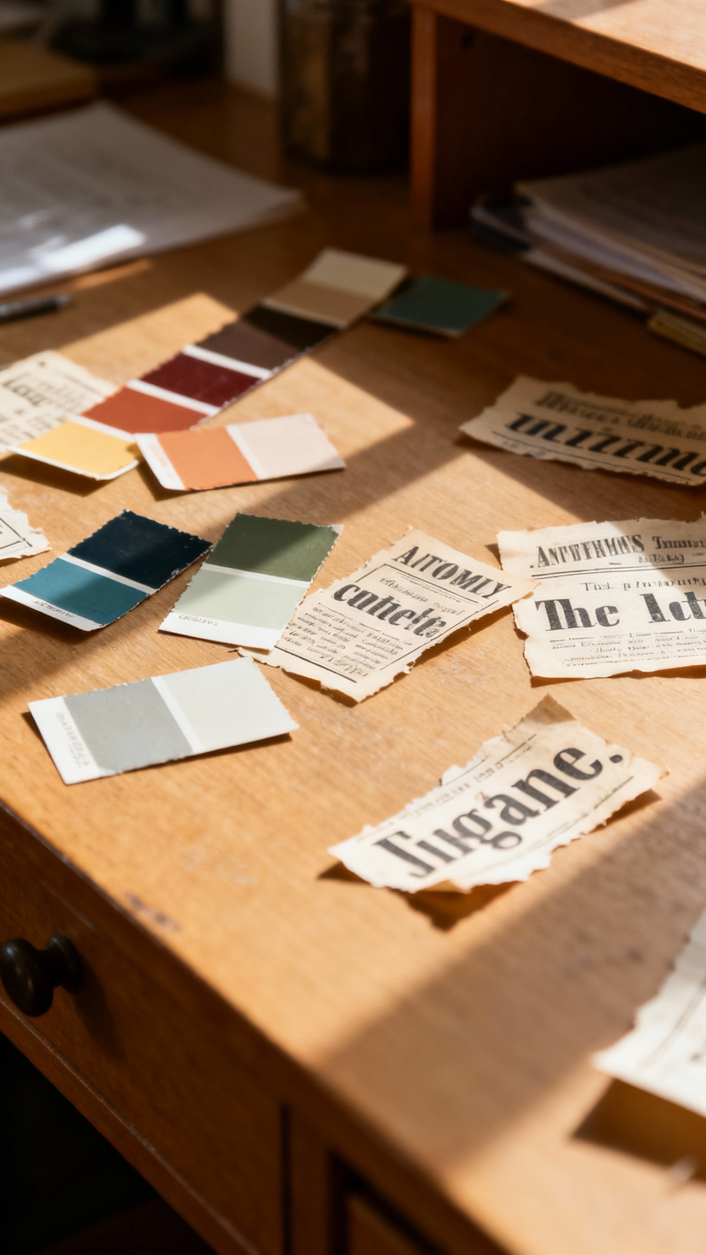
Shop Your Inputs Like a Curator
You need ingredients worth tasting. Don’t just hoard pretty pictures—hunt for elements your project will actually use. Collect across categories:
- Color: swatches, paint chips, gradients from photos, seasonal palettes
- Typography: screenshots of fonts in use, display vs. body text ideas
- Textures & materials: paper fibers, linen, brushed metal, clay
- Composition: layouts, spacing, grids, negative space examples
- Imagery: photography styles, illustration types, icon directions
- Reference brands: not clones—just vibes you respect and why
Pro tip: save the source link and why you saved it.
A tiny note like “love the muted contrast” beats guessing later. IMO, 30 smart pieces beat 300 meh ones.
Where to Look Without Falling Into a Scroll Hole
- Pinterest for broad themes and adjacent vibes
- Behance/Dribbble for tight, polished case studies
- Magazines/books for unexpected typography and print textures
- Real life: museums, boutique shops, signage, packaging
- Your camera roll—yes, that shadow on your desk counts

Edit Like a Ruthless DJ
Time to cut the noise. Lay everything out and start pruning until the board sings. Keep only what:
- Supports your one-line intention
- Introduces something usable (color, type, layout, tone)
- Repeats a pattern that matters (e.g., soft curves, muted contrast, asymmetry)
If you love it but it doesn’t fit?
Park it in an “offcuts” board. You’ll feel better and your main board stays crisp. Think 15–30 pieces max—beyond that, your brain clocks out.
Three Quick Tests
- Five-second scan: Does the vibe hit instantly?
- Consistency check: Do at least three items echo the same mood?
- Utility check: Can you point to each piece and say what it informs?
Build Your Board Like a Story, Not a Junk Drawer
Placement matters.
Your board should guide eyes and decisions, not look like you spilled your downloads folder. Organize into zones:
- Top row: anchor vibe (hero images, textures, big mood)
- Middle: color and type—make mini palettes and type pairings
- Bottom: application—mockups, UI snippets, packaging, layouts
Size equals priority. Blow up the non-negotiables (e.g., that perfect color palette), shrink the maybes. Think of it like directing attention with volume knobs.
Color and Type: Make Them Do the Work
- Palette: pick 1–2 dominant colors, 2–4 supporting, and 1 accent. Show them as blocks and in photo examples.
- Type: pair one display style with one body style.
Add a note like “serif headlines, humanist sans for body.”
- Contrast: include a light-on-dark and dark-on-light example to test legibility.
Go Beyond Aesthetic: Define the Feel in Words
Language clarifies what images can’t. Add a small text lane with 5–7 adjectives and a short descriptor. Adjectives: warm, tactile, grounded, modern, bookish, slow, intimate Descriptor: “Quiet confidence with handmade edges.” Why do this? Because when someone says, “Can we make it more poppy?” you can point to the board and say, “That’s not our vibe.” Boundaries save time.
And sanity.
Add Do/Don’t Mini Rounds
Two small clusters can prevent scope creep:
- Do: uncoated paper, soft shadows, desaturated greens, serif headlines
- Don’t: glassmorphism, neon accents, stocky stock photos, techy icon sets
Make It Collaborative Without Turning It Into a Committee
Share your board early with 1–3 trusted people. Ask targeted questions, or you’ll get chaos. Prompt them with:
- “What three words come to mind?”
- “What feels off-brief?”
- “Which two elements should be non-negotiable?”
Capture feedback on the board using short notes. Then iterate once.
Not seven times. This is a springboard, not a treaty negotiation.
Turn the Moodboard Into Decisions
A moodboard only works if it leads to action. Translate the vibe into starter rules. Create a mini spec from your board:
- Color: HEX/RGB values of the 5–7 core colors
- Type: two fonts with sizes and roles (H1, H2, body)
- Imagery: guidelines like “natural light, muted contrast, shallow depth of field”
- Layout: examples of spacing and grid rhythm
Then make a 10-minute prototype using only those rules—one landing section, a cover slide, a business card, whatever fits your project.
If it clicks, your board works. If it doesn’t, tweak the board, not your soul.
Keep It Alive
Mood shifts happen. Keep a “v2” tab for small evolutions:
- Seasonal color shifts
- New type accents
- Updated image direction as your content evolves
Update intentionally, not impulsively.
Trend-chasing is a full-time job with no benefits.
FAQ
Should I make a digital or physical moodboard?
Both work. Digital boards (Figma, Canva, Milanote, Pinterest) make collaboration and sourcing easy. Physical boards (magazines, fabric, printouts) give you texture and happy accidents.
If you can, do both: digital for sharing, physical for vibe-checking IRL.
How many images should I include?
Aim for 15–30 thoughtfully chosen pieces. Enough to cover color, type, texture, composition, and application without drowning your eyes. Quality over volume—IMO, fewer strong references create faster, clearer decisions.
What if I like too many styles?
Pick one primary vibe for this project and create a “parking lot” board for everything else.
You protect the project’s clarity while honoring your eclectic taste. You’re not deleting styles—you’re sequencing them.
Can I use other people’s work on my moodboard?
Yes, for internal reference and inspiration. Credit where possible and never present someone else’s work as your own deliverable.
If something becomes a direct influence, note it and adapt responsibly.
How do I avoid making a cliché board?
Blend sources outside your niche. If you’re designing a tech site, pull from editorial magazines, vintage packaging, or architecture. Also, prioritize specificity—“muted sage with uncoated paper texture” beats “soft green.”
What’s the fastest way to get unstuck?
Set a 30-minute sprint: write your one-line intention, collect 20 items, cut to 12, arrange into three zones, and pick a color and type pair.
Then build a single slide/poster using only those choices. Action kills perfectionism.
Conclusion
A great moodboard doesn’t show everything you like—it shows exactly what you need. Start with a clear vibe, curate across categories, edit hard, and lay it out like a story.
Then turn the board into rules and a tiny prototype. Do that, and your moodboard won’t just look inspiring—it’ll make work happen. FYI: that’s the whole point.
Explore More & Elevate Your Celebration
If you’re planning a dreamy and romantic wedding, explore our Weddings category for timeless inspiration, elegant decor ideas, and essential planning tips.
For stylish birthday celebrations filled with warm glow and feminine touches, visit our Birthdays category.
If you’re hosting a party or elegant soirée and need ideas, stylish setups and glow-approved decor, explore Parties & Events.
For refined tablescapes, elegant decorating ideas, and styling inspiration that transforms any celebration, visit Decor & Styling.
If you want to stay organized, plan stress-free, and make your celebration feel effortless, explore our Planning category.
For soft, glowing, magical ideas and warm inspiration to elevate every moment, discover our Inspiration category.