It’s easy to get swept up in pretty swatches and flawless layouts, but the real secret to a wedding moodboard that feels like you is honesty. You want your moodboard to scream “us” without a single cousin asking, “But where’s the crown molding?” Today, we’ll skip the Pinterest chaos and build something bite-sized, personal, and totally doable. Ready to design a vibe that’s unmistakably yours? Let’s dive in.
What a moodboard actually does for your wedding vision
You don’t need a thousand swatches to tell your story. A moodboard is your visual promise to your future self and your guests. It’s the place where colors flirt, textures whisper, and the vibe takes shape before you commit to invitations you’ll regret later.
– It saves time by pointing you toward what you love (and away from what you don’t).
– It helps vendors understand your vibe without a thousand emails.
– It becomes your reality-check when decisions get loud.
If you’ve ever felt overwhelmed by wedding “ideas” that go nowhere, this is your antidote. FYI, a focused moodboard is more useful than a wildcard Pinterest board with every trend imaginable.
Start with the core feeling: the vibe you want to wake up to
Before you collect rugs, florals, or fonts, give your moodboard a north star. Think about the feeling you want walking into the ceremony—soft and romantic, bold and playful, rustic and cozy, or modern and minimalist.
- Name the vibe in one line. It can be as silly as “Cake, confetti, and croissants” or as chic as “stone, forest, and candlelight.”
- Pick three adjective words that nail it. For example: warm, tactile, intimate.
- Reference a non-wedding source for mood: a favorite vacation photo, a cafe, or a design magazine cover.
Deeper dive: how color works with mood
Colors aren’t just pretty—they’re practical. If your vibe is cozy and romantic, you’ll reach for muted blush, warm ambers, and earthy greens. If you’re going bold and modern, think high-contrast black accents with soft neutrals to balance.
– Start with one hero color.
– Add two supporting neutrals.
– Sprinkle an accent color sparingly.
Want a quick exercise? Grab three things you absolutely love this week (a scarf, a café cup, a piece of art). Pull out the dominant color from each. That’s your color palette in disguise.
Collect purposeful samples, not random pretty stuff
Texture over trend wins every time. Your moodboard should feel tactile, not a Pinterest scrollathon.
– Gather fabric swatches: velvet, linen, cotton, burlap—whatever your vibe calls for.
– Snag materials that mimic your spaces: a photo of a moss wall, a linen napkin, marble tile, wood grain.
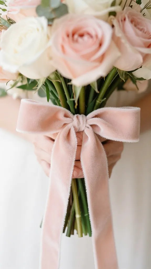
– Include a few floral textures or images to anchor seasonal vibes.
Pro move: don’t fill a board with every bloom imaginable. Pick two or three that feel right for your season and setting, and let the rest support them.
Block planning: the layout that makes sense
– Put your hero element in the center (think “the moment” you want people to remember).
– Surround it with textures that echo the space (a ribbon of color, a fabric sample, a photo of the ceremony arch).
– Add typography notes and invitation style as nudges, not novellas.
Let the space decide: how your venue shapes the mood
Your venue isn’t background scenery—it’s a partner. The architecture, light, and surroundings will amplify your mood in the most unexpected ways.
– If you’re indoors with lots of warm light, lean into cozy textures and soft colors to complement the glow.
– If you’re outdoor and rustic, layer natural elements—wood, stone, greenery—along with delicate fabrics to soften the scene.
– If your venue is modern and airy, balance with clean lines, minimal florals, and a restrained color palette.
- Make a “venue influence” strip: note three things about the space you want to honor (e.g., warm wood, ceiling height, natural light).
- Match textures to the room’s personality—don’t fight the architecture.
Deeper dive: lighting’s role in mood
Lighting changes everything. It can turn a bright day into a romantic magic hour or a dim room into a cozy den. Think about:
– Natural light behavior at your ceremony time.
– Where you’ll place candles, string lights, or lanterns.
– How your colors look under different light (warm vs. cool bulbs).
Interest point: the “quiet luxury” trick
Even if you love maximalist vibes, you can achieve a refined mood by selecting a few luxe-textured pieces (think velvet, satin, or brushed metals) and pairing them with calm, simple backgrounds.
Typography and details: small choices, big impact
Fonts can scream or soothe. The right pairing sets the stage for your entire aesthetic.
– Pick a primary typeface for headings and a secondary for body text.
– Consider how your font color will read on invitations, signage, and digital save-the-dates.
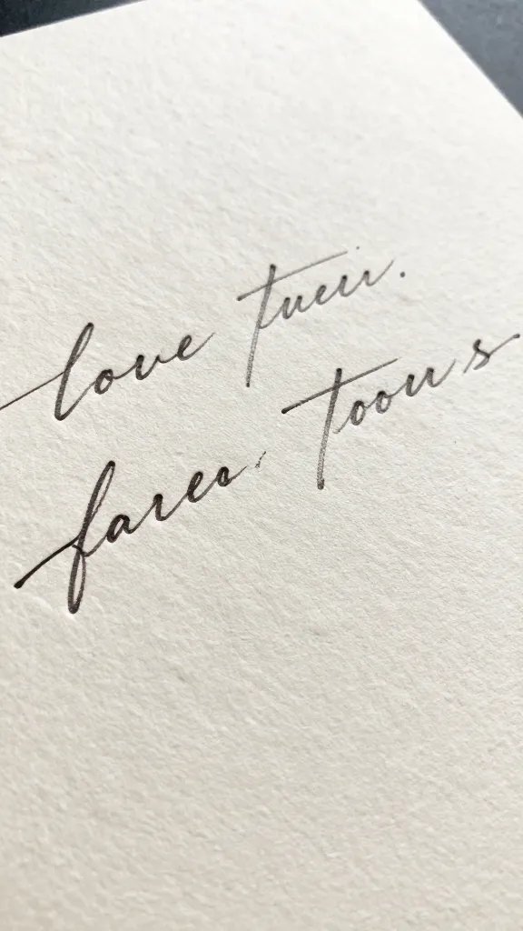
– Use calligraphy or handwritten touches sparingly to avoid clutter.
- Save one font pairing you actually like and one you hate. Your future self will thank you.
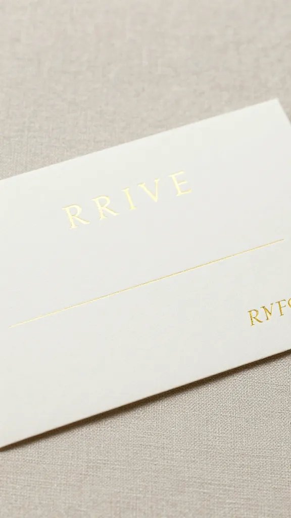
- Test readability at small sizes—your guests will be squinting at RSVP cards.
Subtle details that signal your vibe
– Menu cards that reflect your favorite foods or a shared joke.
– Signage in a language or emoji style that feels “you.”
– A small, meaningful ritual (a wine toast with a family favorite varietal, for example).
Organic additions: spontaneity without chaos
A moodboard should feel alive, not robotic. Leave space for two or three elements that don’t fit perfectly but add personality.
– Reserve room for a last-minute inspiration from a flower vendor or a family heirloom.
– Consider a color pop you didn’t plan—accidents here are often the best.
When to say “yes” to a spontaneous idea
If it makes the core feeling stronger or tells your story more clearly, fold it in. If it feels forced, it probably is. Trust your gut and FYI, your photographer will thank you for the clarity.
FAQ
How detailed should my moodboard be?
Aim for clarity, not a thousand tiny notes. Include color swatches, textures, photos that feel right, typography notes, and a few layout ideas. If you can describe it in a sentence, you’re good.
Should I use digital or physical moodboards?
Both work. Digital boards are easy to share with vendors, while a physical board can be a tactile reminder during planning sessions. You can even start digital and print a compact version for your planner or wall.
How many elements should I include?
Think in bundles rather than a barrage. Three to five core elements (color, texture, lighting, floral direction, and architecture) plus three supporting accents usually does the trick.
What if my partner has a different vision?
Have a joint vision conversation. Find overlap and be willing to compromise on non-essentials. A moodboard should feel like a shared map, not a battleground.
How often should I revisit and revise my moodboard?
As you lock in major vendors or decide on a venue, revisit. Your moodboard should evolve with the plan, not stay frozen in the early brainstorming stage.
Conclusion
Your wedding moodboard is more than pretty pictures—it’s your personal design brief, your shared North Star, and your future self’s best friend. By starting with a vibe, selecting purposeful textures, honoring the space you’re saying “I do” in, and keeping details intentional, you’ll end up with a moodboard that feels undeniably you.
If you’re ever unsure, ask yourself: Does this choice enhance the feeling I want guests to experience? Does it tell our story without saying a word? If yes, you’re on the right track. IMO, that’s the secret sauce that makes a wedding moodboard feel like you—and that feeling is the whole point. And hey, if you get overwhelmed, take a breath, step away, and come back with one clear question to answer—that’s how you keep the magic intact.
Explore More & Elevate Your Celebration
If you’re planning a dreamy and romantic wedding, explore our Weddings category for timeless inspiration, elegant decor ideas, and essential planning tips.
For stylish birthday celebrations filled with warm glow and feminine touches, visit our Birthdays category.
If you’re hosting a party or elegant soirée and need ideas, stylish setups and glow-approved decor, explore Parties & Events.
For refined tablescapes, elegant decorating ideas, and styling inspiration that transforms any celebration, visit Decor & Styling.
If you want to stay organized, plan stress-free, and make your celebration feel effortless, explore our Planning category.
For soft, glowing, magical ideas and warm inspiration to elevate every moment, discover our Inspiration category.