You stared at the color wheel for so long it started to look like a pizza. Every shade feels “almost right” and then… nope. If your brain short-circuits every time someone asks, “So what are your wedding colors?” you’re not alone.
Let’s make this easier (and honestly, more fun) so you can stop doom-scrolling swatches and start feeling confident about your palette.
Start With Your Vibe, Not the Color Wheel
Forget hues for a sec. What’s the mood of your day? Cozy backyard dinner party?
Chic city rooftop? Romantic garden tea party with too many candles and zero regrets?
- Pick three vibe words: examples — modern, whimsical, boho, classic, coastal, moody, minimalist.
- Picture the setting: venue style, season, time of day. Sunset barn = warm tones; marble ballroom = crisp tones.
- Define your “nope” list: glitter? neon? anything too pastel?
Eliminate the noise early.
Vibe-to-Color Translation
- Modern + Minimal = charcoal, crisp white, metallic accents
- Romantic + Garden = blush, sage, soft neutrals
- Moody + Luxe = emerald, merlot, black, antique gold
- Coastal + Airy = powder blue, sand, ivory
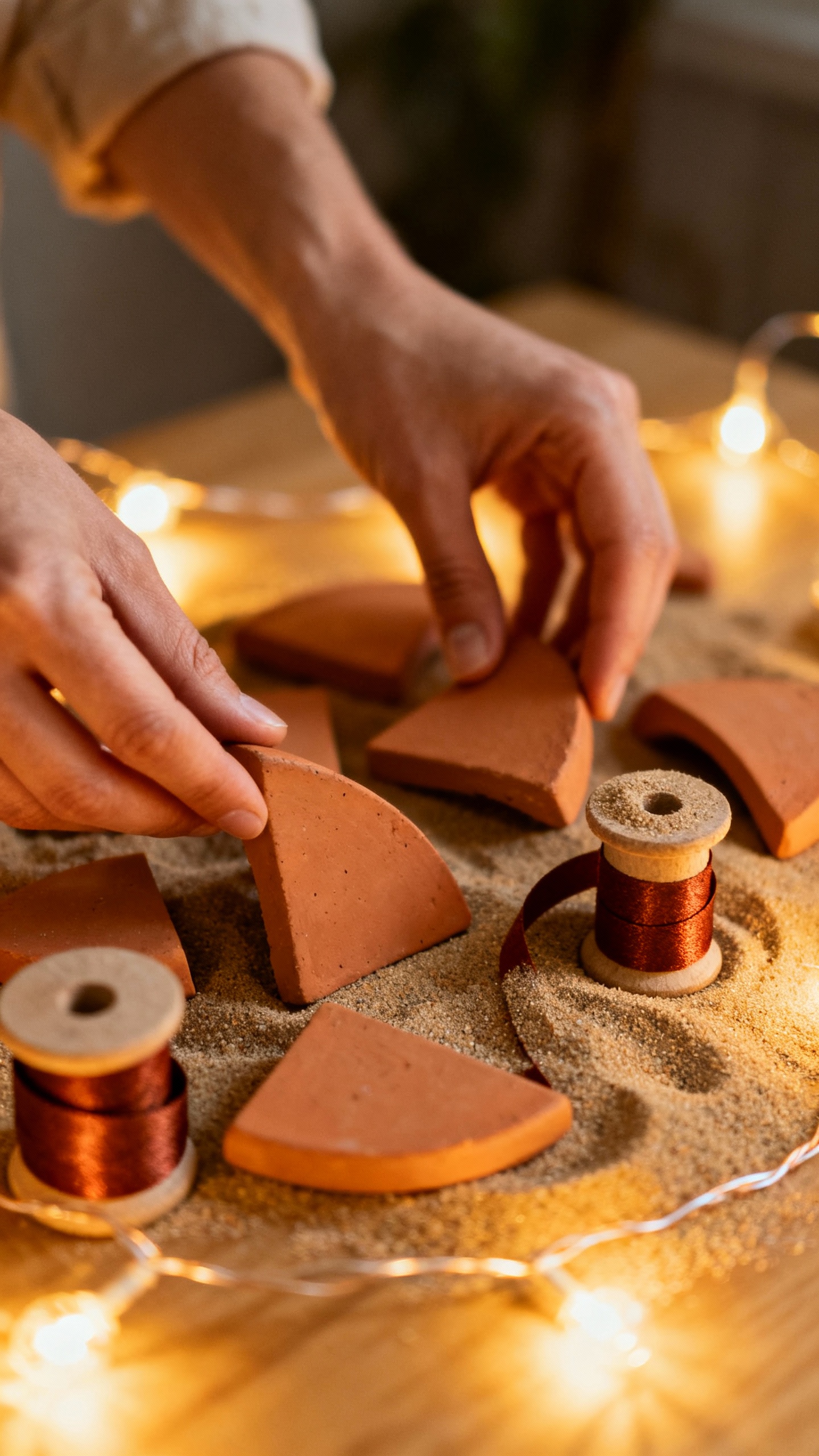
- Boho + Earthy = terracotta, rust, clay, soft peach
Use the 60/30/10 Rule (Because Math Helps)
You don’t need a thousand colors. You need a ratio. The 60/30/10 rule keeps everything balanced and intentional.
- 60% base: your neutral that shows up everywhere (linens, suits, big backdrops).
- 30% support: your medium shade that sets the tone (bridesmaids, florals, stationery).
- 10% pop: the fun accent that adds personality (napkins, candles, signage, ribbons).
Example Palettes
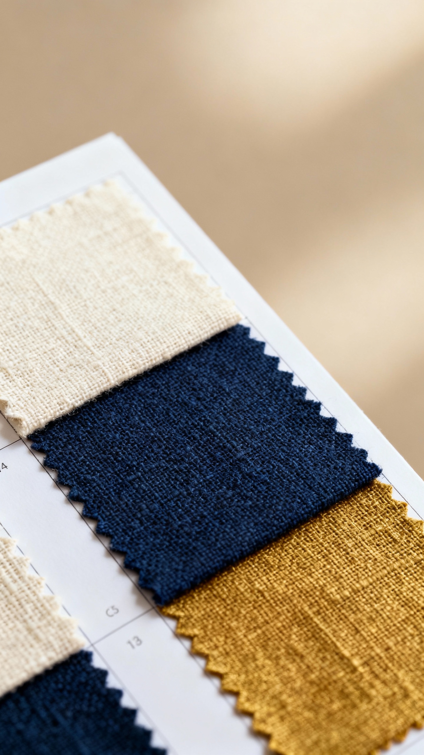
- Classic: 60% ivory, 30% navy, 10% antique gold
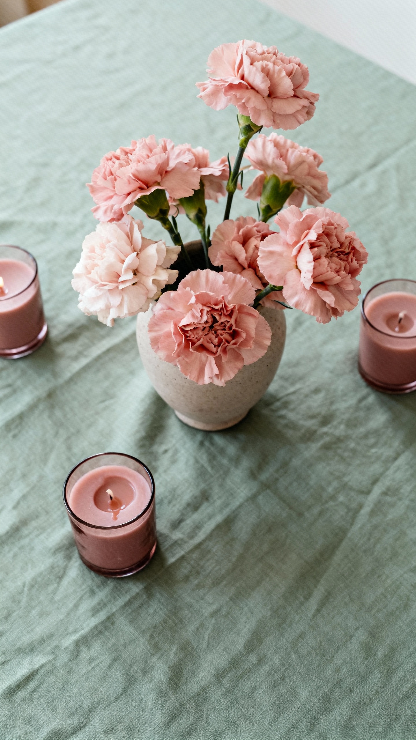
- Garden: 60% soft sage, 30% blush, 10% dusty rose
- Moody: 60% charcoal, 30% emerald, 10% black with brass accents
- Desert Chic: 60% sand, 30% terracotta, 10% rust
Borrow From What You Already Love
Your closet, home decor, and phone background already tell a color story.
Lean into that. If you live in creams and camel, don’t force yourself into hot pink just because Pinterest told you so.
- Wardrobe scan: What colors do you wear on repeat? That’s your comfort zone.
- Home palette: Your couch, rug, or favorite throw blanket = effortless baseline.
- Saved inspo: Screenshot 8–10 favorite images.
Notice the overlap. That’s your palette whispering.
Quick Edit Trick
Drop your screenshots into a collage app and blur the whole thing. If the blurred vibe feels cohesive, you nailed it.
If it looks chaotic, trim the outliers.
Let the Season Help (But Don’t Let It Boss You)
You can absolutely rock jewel tones in July, but seasonality gives you easy guardrails.
- Spring: lilac, sage, butter yellow, soft peach
- Summer: sky blue, coral, punchy pinks, crisp white
- Fall: rust, marigold, forest green, plum
- Winter: burgundy, evergreen, navy, metallics
FYI, the trick is less about color and more about tone. Dusty versions read soft; saturated versions feel bold. You control the dial.
Work With Your Venue, Not Against It
Your venue already brings a palette.
Use it so everything feels intentional (and so you’re not fighting the carpet).
- Lots of wood + warm light: earthy neutrals, amber glass, terracotta shine.
- White gallery or loft: high-contrast looks amazing — black, emerald, cobalt, or clean neutrals.
- Historic hotel with patterned carpets: pull 2–3 colors from the pattern and treat it like your base.
- Outdoor garden: greens everywhere make pinks, peaches, and whites pop naturally.
Lighting Reality Check
What looks chic in daylight can turn weird at night. Ask your venue for photos of evening events. Colors shift under string lights and candles. Test swatches in your actual lighting if you can.
IMO, candles make everything hotter (color temperature-wise and also, you know, romantically).
Choose a Neutral You Love (And Build From There)
If you freeze when you see ten hues, start with one neutral you adore. Then add two friends.
- Warm neutrals: ivory, cream, sand, taupe
- Cool neutrals: white, gray, charcoal, slate
- Trend neutrals: greige, mushroom, oat milk beige (yes, that’s a thing now)
Pick your neutral, then layer:
- Choose a support color that contrasts in temperature (warm neutral + cool support, or vice versa).
- Add a pop color that you’d happily wear as lipstick or a tie. If you wouldn’t wear it, don’t make it your accent.
Build a Palette You Can Actually Execute
A gorgeous palette means nothing if your florist can’t source those flowers or your rental company doesn’t stock those linens.
Practical, but crucial.
- Ask vendors for swatch books before you commit.
- Check availability for seasonal blooms (terracotta roses vary wildly by vendor).
- Plan a backup accent in case something’s out of stock (swap coral for poppy, burgundy for oxblood).
Create a Mini Brand Guide
Yes, like a tiny mood board for your wedding.
- 3–5 hex codes (pull from a color picker tool)
- One fabric swatch or ribbon for each main color
- Photo examples of florals, stationery, and tables that match your scheme
Share this with vendors so everyone speaks the same color language. Less “uhhh is this the right pink?” more “nailed it.”
When You Truly Can’t Decide: Commit to a Range
Paralyzed between sage and eucalyptus? Consider a tonal palette.
You choose a color family instead of one exact shade. It looks layered and intentional, not messy.
- Greens: eucalyptus, olive, sage, moss
- Blues: powder, French, slate, navy
- Pinks: blush, rose, petal, dusty mauve
Another hack: pair one color family with a metallic. Emerald + gold.
Navy + silver. Blush + rose gold. Easy, chic, done.
Don’t Forget the People Wearing the Colors
Your palette lives on humans.
Make it wearable and flexible.
- Mismatched bridesmaids in one color family = beautiful and effortless.
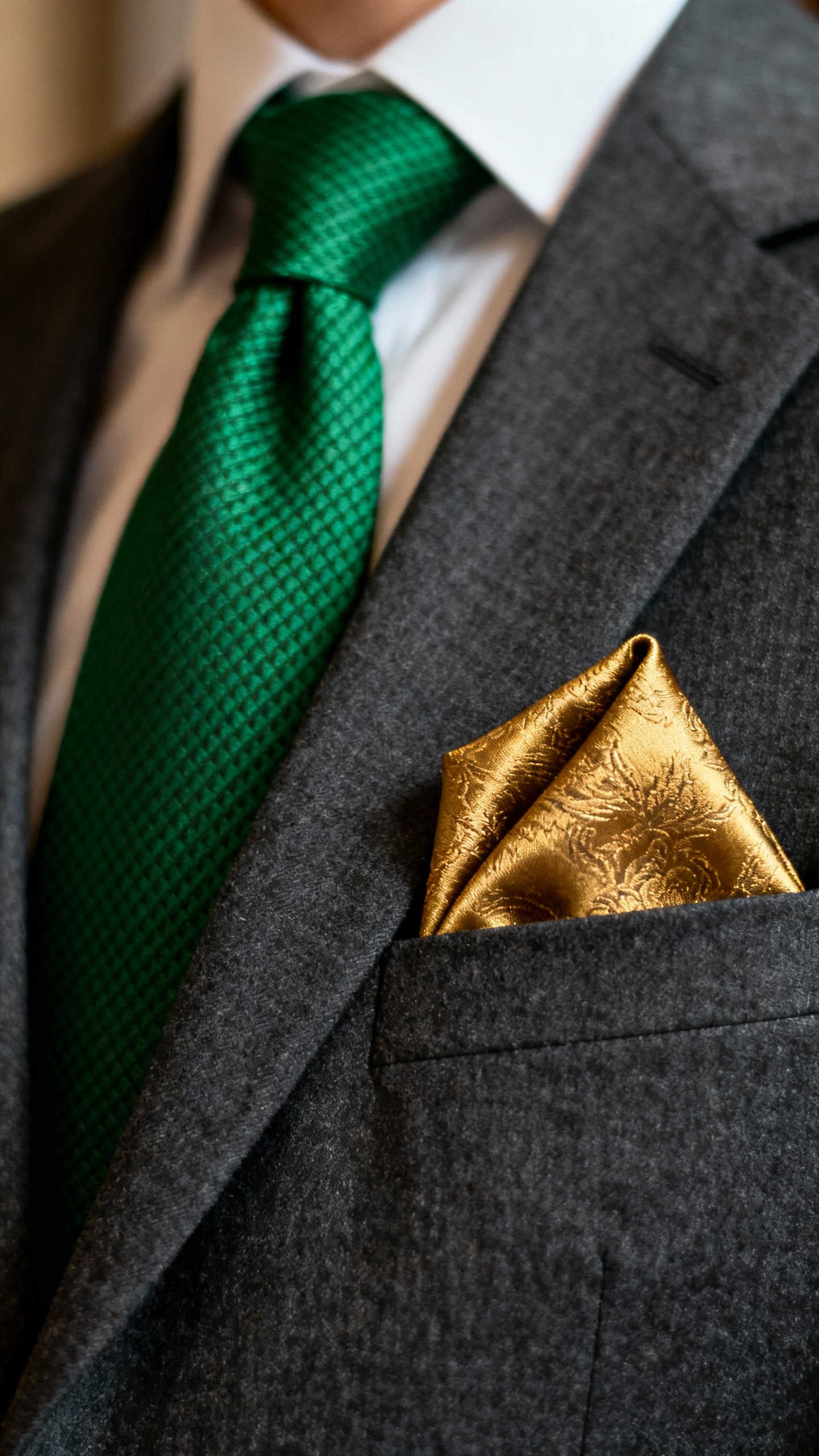
- Ties/pocket squares can be your accent pop if you keep suits classic.
- Florals can introduce color without committing to bold dresses or linens.
IMO, giving your wedding party a color range instead of a single swatch saves everyone stress (and returns). Your cousin can find something flattering, and you still get cohesion.
FAQs
How many wedding colors should I choose?
Three usually works best: one base, one support, one accent. You can add a metallic as a “neutral-plus.” If you love depth, go tonal with variations of the same color family.
More than four gets chaotic fast.
Can I mix warm and cool tones?
Absolutely, and it looks sophisticated when you balance it. Try a warm base (sand) with a cool support (slate) and a warm pop (terracotta). The contrast creates dimension without clashing.
What if my partner and I have totally different preferences?
Blend your vibes with a split: one person chooses the base, the other chooses the accent, and you compromise on the support.
Or designate spaces: ceremony leans one way, reception leans the other. Teamwork, not thunderdome.
Do I need to match the invitations to the exact colors?
No, but keep the family consistent. Your invites set the mood, not a Pantone prison.
Use complementary tones, and keep typography and textures aligned with your vibe.
How do I test colors without buying everything?
Order small swatches, ribbon spools, and a few taper candles. Print your invite design at home. Throw them on your kitchen table with a sprig of greenery and see what sings under your actual lighting.
Cheap and wildly helpful.
What if I change my mind halfway through planning?
It happens. Keep your base neutral and pivot your accent. Swap napkins, ribbons, and candles; adjust florals slightly.
Vendors expect tweaks—just give them a clear updated palette and enough lead time.
Conclusion
You don’t need a color epiphany. You need a vibe, a simple ratio, and a palette you can actually source. Start with what you love, let your venue and season guide you, and use tonal ranges when indecision hits.
Keep it flexible, keep it fun, and remember: your colors should serve your day—not the other way around. FYI, once you choose, stop scrolling. You’re golden.
Explore More & Elevate Your Celebration
If you’re planning a dreamy and romantic wedding, explore our Weddings category for timeless inspiration, elegant decor ideas, and essential planning tips.
For stylish birthday celebrations filled with warm glow and feminine touches, visit our Birthdays category.
If you’re hosting a party or elegant soirée and need ideas, stylish setups and glow-approved decor, explore Parties & Events.
For refined tablescapes, elegant decorating ideas, and styling inspiration that transforms any celebration, visit Decor & Styling.
If you want to stay organized, plan stress-free, and make your celebration feel effortless, explore our Planning category.
For soft, glowing, magical ideas and warm inspiration to elevate every moment, discover our Inspiration category.