Color can make your event feel like a dreamy dinner party… or a fluorescent nightmare. The right palette sets the mood, flatters your space, and makes every photo look intentional. The wrong one?
Harsh lighting, clashing linens, and centerpieces that scream “Pinterest fail.” Let’s nail the palette so your event looks curated, not chaotic.
Start With Your Event’s Story
What’s the vibe? Cozy and intimate, bold and modern, or whimsical and romantic? Your color palette should match the story you want guests to feel the second they walk in. Think about:
- Purpose: celebration, corporate, charity, milestone
- Time of day: brunch vs. evening gala
- Formality: black-tie elegance vs. backyard chill
If your event is a minimalist cocktail party, you won’t pick candy-bright pastels.
And if it’s a kid’s birthday, you probably won’t go with moody charcoal and oxblood (…unless your kid is very avant-garde).
Let Your Venue Boss You Around (A Little)
Your space sets the stage. Work with what you’ve got so your palette complements rather than competes. Check these first:
- Existing colors: carpeting, walls, drapes, wood tones
- Lighting: warm vs. cool bulbs, natural light windows
- Ceiling height and room size: darker colors can shrink; lighter can open
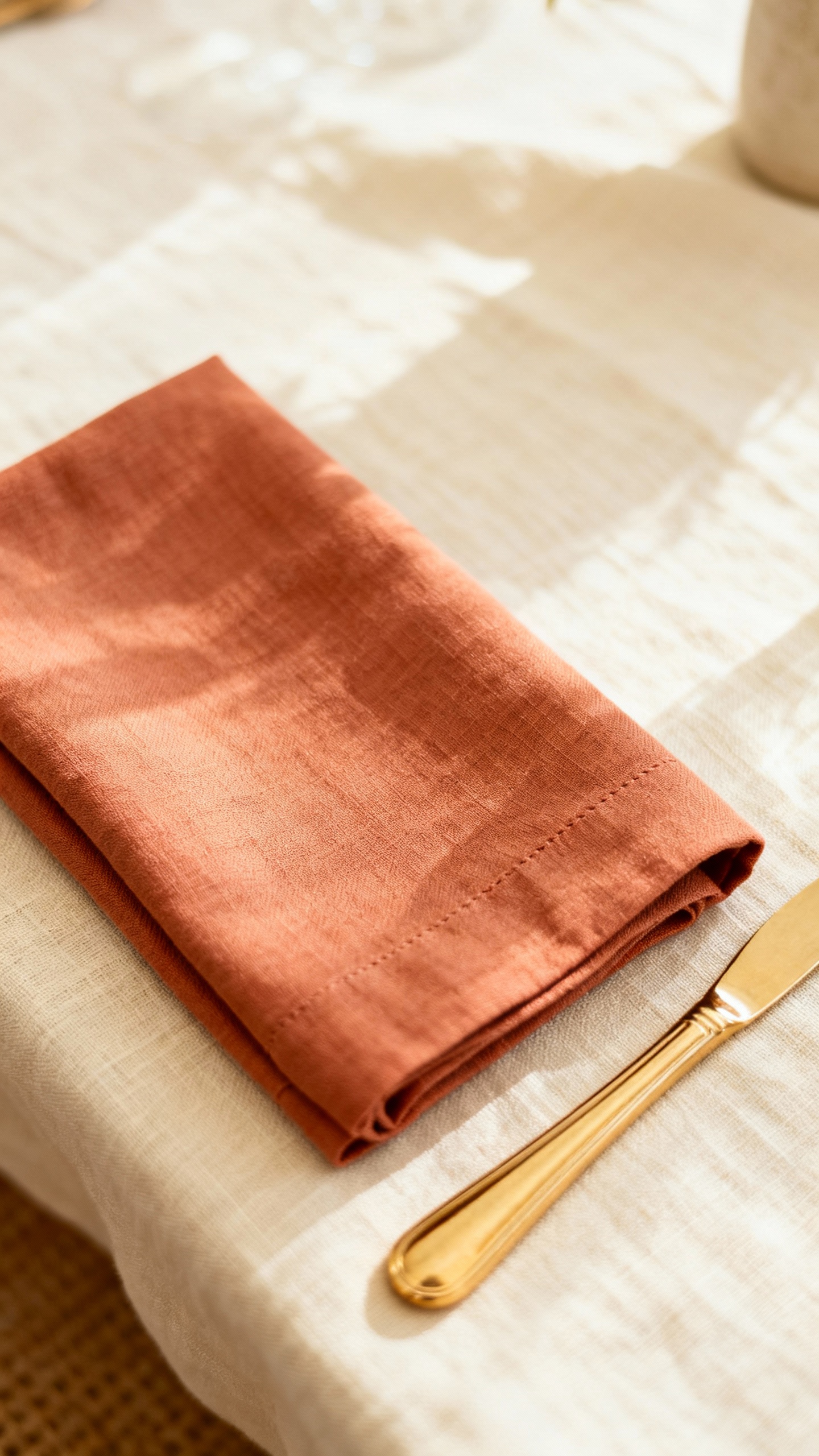
IMO, it’s smarter to echo the venue’s undertones than fight them. Warm brick?
Lean into terracotta, blush, and cream. Cool industrial concrete? Try slate, eucalyptus, and white for balance.
Quick Venue Cheats
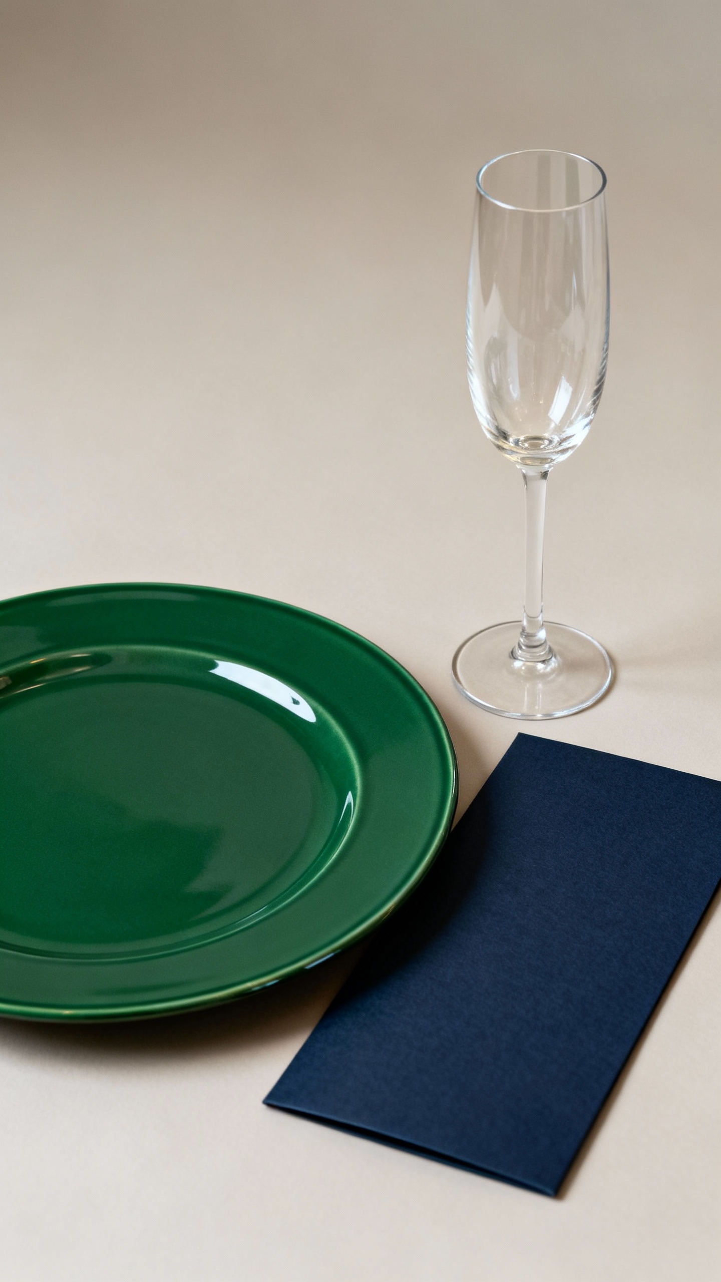
- Ballroom with gold accents: navy, emerald, cream, and metallic gold sing
- Garden or outdoor setting: sage, dusty blue, butter yellow, and white feel fresh
- Warehouse loft: black, pewter, fig, and soft taupe look chic (FYI: add texture)
Build a Palette Like a Pro: The 60-30-10 Rule
We love a simple formula that saves your brain.
Use 60-30-10 to structure your palette.
- 60% Base: Your neutral anchor (ivory, greige, charcoal, soft blush)
- 30% Secondary: Your main color (sage, navy, terracotta, lilac)
- 10% Accent: Your pop (mustard, coral, metallics, black)
This keeps everything balanced and intentional. You won’t drown in too much color, and you won’t fall asleep from too much beige. Win-win.
Pick Your Neutrals First
Neutrals get underestimated.
They create breathing room and make your accents shine. Choose one warm and one cool neutral option when sampling—your venue lighting will decide the winner. Yes, lighting is bossy.
Use Color Theory (Without Needing an Art Degree)
No need to memorize a wheel—just remember these easy combos.
- Monochromatic: One color, multiple shades.
Example: dusty rose, blush, mauve. Soft and cohesive.
- Analogous: Neighbors on the wheel. Example: blue, teal, green.
Calm and natural.
- Complementary: Opposites. Example: navy and rust. High contrast, very photogenic.
- Triadic: Three evenly spaced colors.
Example: coral, mustard, teal. Bold and fun—use carefully.
IMO, complementary and analogous palettes work best for events. They look polished without screaming “graphic design project.”
Warm vs.
Cool
Warm colors (terracotta, caramel, marigold) feel cozy and inviting. Cool tones (slate, eucalyptus, lavender) feel modern and calm. Mix deliberately:
- Warm palette with cool accents: terracotta + cream + dusty blue = chef’s kiss
- Cool palette with warm accents: slate + white + mustard = instant depth
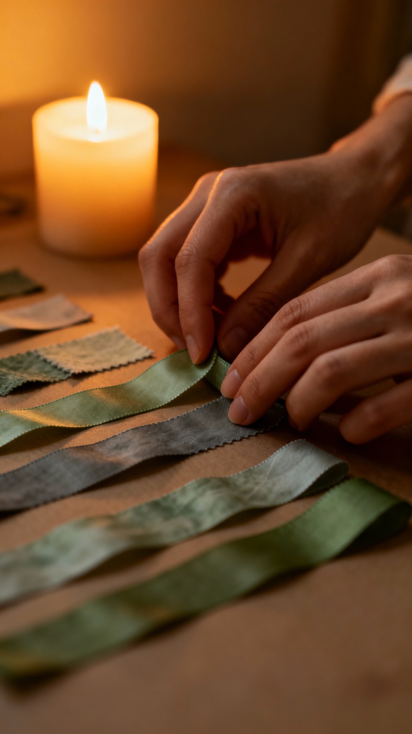
Test It IRL: Samples, Swatches, and Screens
Your phone lies to you.
Screens distort colors and lighting changes everything. Test your palette in real life. Do this:
- Gather fabric swatches, ribbon, paper goods, and a printed mood board.
- Visit the venue at your event time for true lighting conditions.
- Place swatches on tables next to plates/glassware to check reflections.
- Snap photos with and without flash. If it looks sad on camera, rethink it.
Lighting Matters (A Lot)
Warm bulbs shift colors yellow; cool bulbs shift them blue.
Candlelight softens everything. If you plan heavy candlelight, slightly deepen your palette so it doesn’t wash out.
Balance Trends With Timelessness
Trends are fun, but your photos last. You can nod to what’s hot without committing your entire budget to the color of the year. Smart ways to add trend without risk:
- Use trendy shades in napkins, menus, candles, or lounge pillows.
- Keep florals and linens more timeless and neutral.
- Bring trend through texture (velvet, stone, rattan) instead of pure color.
If “neon orchid” is calling your name, go for it—in candles or signage, not the tablecloths.
FYI: it’s easier to pivot small accents.
Consider Skin Tones, Florals, and Photography
Your guests matter. No one wants to look washed out next to a table of screaming chartreuse.
- Skin tones: Avoid ultra-cool lighting with pale blue schemes; it can dull complexions. Warm neutrals flatter most people.
- Florals: Check seasonal availability.
Dahlia season? Lean into rust and burgundy. Spring tulips?
Hello blush and butter yellow.
- Photography: High-contrast palettes pop on camera; low-contrast palettes feel dreamy. Choose based on the vibe you want in photos.
Metallics Are Your Secret Weapon
Metallics act like neutrals with personality. Gold adds warmth, silver cools, blackened bronze feels modern.
Pick one metallic and repeat it for cohesion.
Avoid These Common Palette Pitfalls
We’ve all been there. Let’s skip the chaos.
- Too many colors: Cap it at 3-5 shades total. More equals visual noise.
- No contrast: If everything feels mid-tone, nothing stands out.
Add a darker or lighter anchor.
- Ignoring texture: Velvet navy ≠ satin navy. Texture changes how colors read. Mix matte, glossy, soft, and rough.
- Forgetting the paper goods: Menus, place cards, and signage tie the palette together.
Don’t leave them beige by default.
How to Translate Palette Into Real Decor
You chose your colors—now make them work across the event. Entry and signage: Use your secondary color and metallic to set the tone. Tables: Base color for linens, secondary for napkins or chargers, accent in candles or blooms. Florals: Blend shades of your secondary color; use greenery to soften. Lighting: Ask for dimmers and specify warmth. Uplights in a subtle version of your accent color can look luxe. Staff attire: Keep it neutral so they blend with the scene, not compete with it.
Sample Palettes You Can Steal
- Modern Romance: Blush (base), mauve (secondary), oxblood (accent), champagne metallic
- Coastal Minimal: Soft white (base), dusty blue (secondary), slate (accent), brushed nickel
- Earthy Luxe: Warm taupe (base), terracotta (secondary), olive (accent), antique gold
- Mood & Drama: Charcoal (base), fig (secondary), merlot (accent), blackened bronze
FAQ
How many colors should I use in my event palette?
Aim for 3-5 colors max. Think base, secondary, accent, plus maybe one supporting neutral.
Anything beyond that starts to feel busy and hard to coordinate across vendors and decor.
What if my partner or team loves a color I hate?
Compromise with placement and proportion. Use their beloved shade as the 10% accent rather than the 60% base. That way, it shows up in meaningful moments without overwhelming the design.
Everyone wins, nobody cries.
Do I need to match colors exactly across all materials?
Nope. You want harmony, not rigid uniformity. Slight shifts in shade add depth.
Just keep undertones consistent—warm with warm, cool with cool—so everything feels intentional instead of “close enough.”
How early should I finalize my color palette?
Lock it in 3-4 months out. That timing lets you coordinate rentals, florals, stationery, and linens without rush fees or last-minute substitutions. You can still tweak accents later, but get the core set early.
What colors photograph best?
High-contrast combos (navy + ivory, black + champagne) pop on camera.
Soft neutrals photograph beautifully in natural light but can wash out at night, so deepen one element or add a richer accent for evening events.
Can I mix metallics?
Yes—deliberately. Pair warm (gold) with warm palettes and cool (silver) with cool palettes. If you mix, anchor with one dominant metallic and sprinkle the second in small, repeated touches so it feels cohesive.
Conclusion
Your palette directs the entire experience: mood, photos, even how guests feel in the space.
Start with your story, respect the venue, stick to a simple structure, and test everything in real light. Keep it tight, add contrast, and use texture and metallics for depth. Do that, and your event will look expensive—even if you spent wisely.
IMO, that’s the best kind of magic.
Explore More & Elevate Your Celebration
If you’re planning a dreamy and romantic wedding, explore our Weddings category for timeless inspiration, elegant decor ideas, and essential planning tips.
For stylish birthday celebrations filled with warm glow and feminine touches, visit our Birthdays category.
If you’re hosting a party or elegant soirée and need ideas, stylish setups and glow-approved decor, explore Parties & Events.
For refined tablescapes, elegant decorating ideas, and styling inspiration that transforms any celebration, visit Decor & Styling.
If you want to stay organized, plan stress-free, and make your celebration feel effortless, explore our Planning category.
For soft, glowing, magical ideas and warm inspiration to elevate every moment, discover our Inspiration category.