The way you mix color is the way you tell your celebration story. Bold yellows mean party, deep blues mean cozy vibes, and a splash of metallics? Instant wow. If you’ve ever stared at a color wheel and thought, “This feels expensive,” you’re not alone. Let’s make color your celebration co-pilot—no drama, just style.
Color as Your Celebration Compass

Let’s start with the obvious: color sets the mood faster than a playlist on shuffle. Want energy? Go bright. Want romance? Go soft and warm. Color isn’t decoration—it’s communication. It tells your guests what to expect before you say a word.
– Use a dominant hue to anchor the vibe.
– Pair it with one or two supporting tones for harmony.
– Add a spark color for contrast and punch.
If you’ve ever walked into a room and felt instantly at home, you know color has that magic. The plan here is simple: pick a feeling, pick a color family, and let everything else be a friendly supporter.
Choosing Your Celebration Palette
Your palette is the spine of the whole event. Think of it as your vibe map. You don’t need a dozen shades; you need a few that play nicely together and tell your story.
– Start with one hero color that feels you.
– Choose one or two accomplice colors for balance.
– Bring in a neutral to anchor the scene (think white, charcoal, or warm beige).
Finding Your Mood
Ask yourself: What moment do I want guests to feel when they walk in? Energized? Relaxed? Playful? Your answer guides the palette.
– Energetic: pure primaries or neon accents.
– Cozy: warm neutrals with terracotta or forest green.
– Whimsical: pastel combos or candy-bright contrasts.
FYI, you don’t need to commit to one mood all night. A playful mix can feel intentional if you narrate it with careful placement.
Practical Color Deployment
Color belongs everywhere without shouting, so plan where it lives. Scenery, tableware, lighting, and wardrobe all tell the color story.
– Lighting: bulbs with a color temperature that flatters your palette. Soft warm for romance, cooler light for modern events.
– Table settings: linens, napkins, glassware—oh my eyes. Coordinate them to reflect your palette subtly.
– Signage and paper goods: keep fonts crisp and colors legible.
– Attire hints: someone wearing a color that anchors the room can become a photo anchor.
Where Color Shines Best
– Entrance moments: a color-forward backdrop makes photos pop.
– Dining moments: color on the table draws attention to the feast.
– Afterparty: punchy accents in lighting or confetti can lift the energy.
Remember, strategic color placement beats overwhelming color saturation every single time.
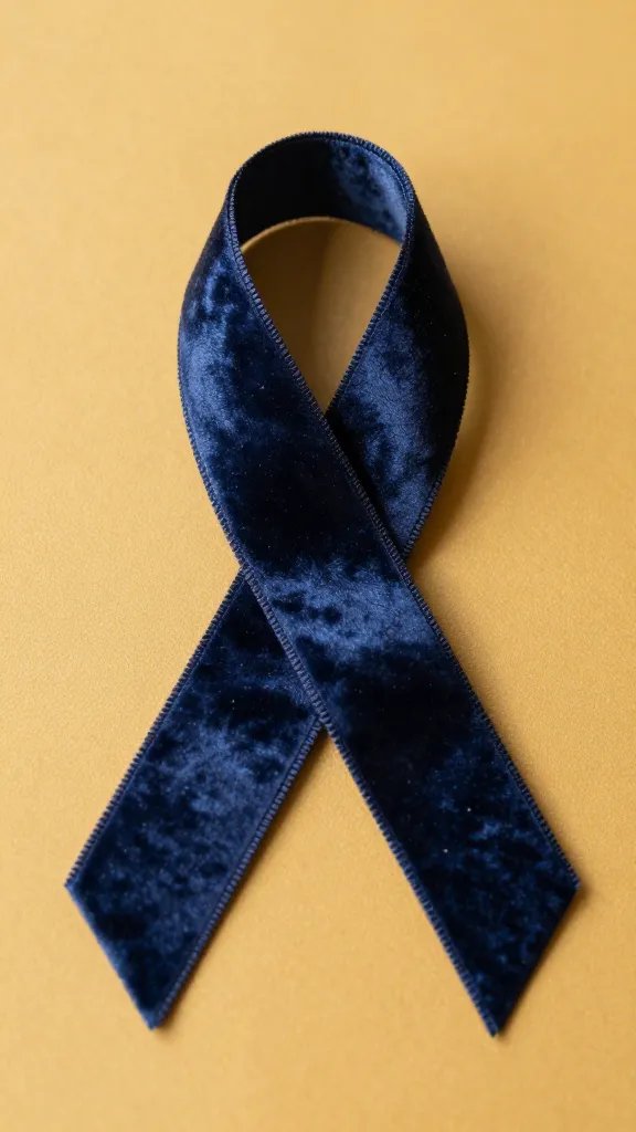
Texture and Tone: Color’s Best Friends
Color isn’t just hue; it’s texture, depth, and warmth. Mix finishes and materials to add dimension without overdoing it.
– Matte vs. glossy: a matte tablecloth with glossy glassware creates contrast.
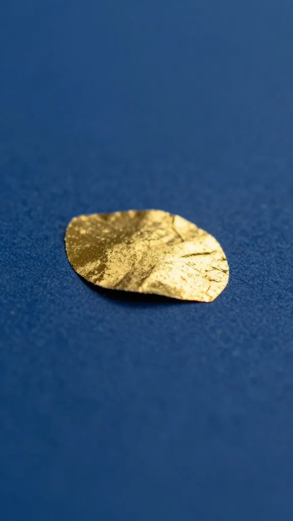
– Metallics: gold, brass, rose gold add sparkle without shouting.
– Natural textures: wood, linen, jute soften bold colors.
Depth Without Drama
If your color feels flat, layer in texture. A velvet cushion, a silk table runner, or a woven placemat can lift a single color into a full experience. Try pairing a punch color with a natural texture to keep things lively but grounded.
Color Rules You Might Break (And Why It Works)
Rules are guides, not commandments. Here are a few color ideas that break conventions but feel right when you pull them off well.
– Monochrome with a wink: one color, multiple shades, one subtle accent.
– Unexpected neutrals: pair a bold color with black-and-white accents for modern drama.
– Seasonal twists: summer yellows and citrus tones, winter jewel tones, spring pastels with a twist.
- Trust your eye—if it makes you smile, it’s working.
- Don’t overdo the neon unless you want a club vibe in the living room.
- Ask a friend for “color truth” before you commit to a large purchase.
Lighting: The Hidden Color Amplifier
Lighting can transform a dull color into something magical. It’s the secret sauce that makes your palette sing.
– Warm lights soften harsh contrasts and give cozy vibes.
– Cooler lights make bold colors look modern and crisp.
– Dynamic lighting (color-changing LEDs, dimmers) can shift the mood as the night evolves.
Practical Lighting Tweaks
– Place lights at table level to highlight centerpiece colors.
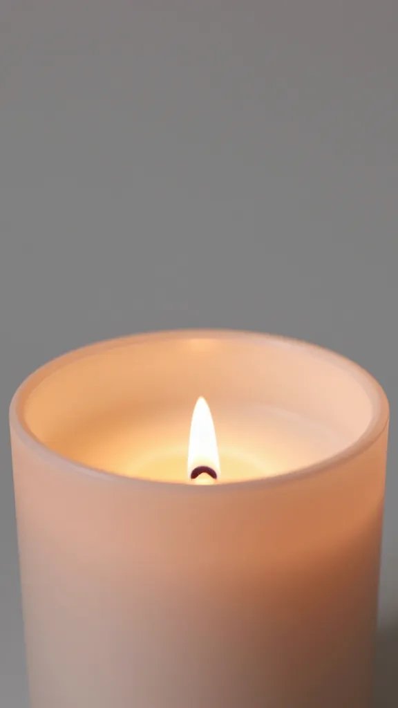
– Use lanterns or candles to add warmth and movement.
– Dim the main lights during toasts and keep accents bright for photos.
How do I start if I’ve never thought about color for celebrations?
Start with one feeling you want guests to leave with. Pick a hero color that embodies that mood, then add one supporting color and a neutral. You’ll be surprised how quickly a cohesive look emerges.
What if my space has existing colors I can’t change?
Treat them as the base. Build a palette around them by choosing accents that harmonize with the walls and furniture. You can also use color-blocked decor or textiles to create a separate, intentional area that stands out.
How do I avoid color fatigue during a long event?
Mix texture and lighting with your colors. Alternate bold elements with calm, neutral spaces. Let guests rest their eyes in quieter corners before returning to the color-forward zones.
Are metallics always necessary?
Nope. Metallics add sparkle and a sense of celebration, but you can achieve similar effect with glossy surfaces and crisp white accents. If you love metallics, use them sparingly on statement pieces.
Can I apply color theory without being a designer?
Absolutely. Use simple pairings—complementary colors for contrast, analogous colors for harmony, or a triadic trio for a lively but balanced look. The key is consistency and intention, not perfection.
Bringing It All Together: A Lightweight Playbook
Here’s a quick checklist to keep you sane while you color your celebration.
– Pick a dominant color that feels like you.
– Choose one or two supporting shades and a neutral.
– Decide where color will appear first (entrance, table, backdrop).
– Layer textures to add depth and avoid flat looks.
– Light thoughtfully to amplify the palette.
If you’re unsure, imagine the event through photos. Does the color story look cohesive in pictures? If yes, you’re on the right path. If not, tweak the balance or swap a shade.
Conclusion
Color is your loud, friendly co-host. It greets guests with a vibe, guides their gaze, and sticks in memory long after the last toast fades. No need for a giant budget or a full-on design team—just a thoughtful palette, smart placement, and a dash of personality. IMO, the best celebrations feel like a story told with color, texture, and a wink. FYI, when you get it right, people will remember the moment long after the confetti settles. Ready to start color-planning your next celebration?
Explore More & Elevate Your Celebration
If you’re planning a dreamy and romantic wedding, explore our Weddings category for timeless inspiration, elegant decor ideas, and essential planning tips.
For stylish birthday celebrations filled with warm glow and feminine touches, visit our Birthdays category.
If you’re hosting a party or elegant soirée and need ideas, stylish setups and glow-approved decor, explore Parties & Events.
For refined tablescapes, elegant decorating ideas, and styling inspiration that transforms any celebration, visit Decor & Styling.
If you want to stay organized, plan stress-free, and make your celebration feel effortless, explore our Planning category.
For soft, glowing, magical ideas and warm inspiration to elevate every moment, discover our Inspiration category.